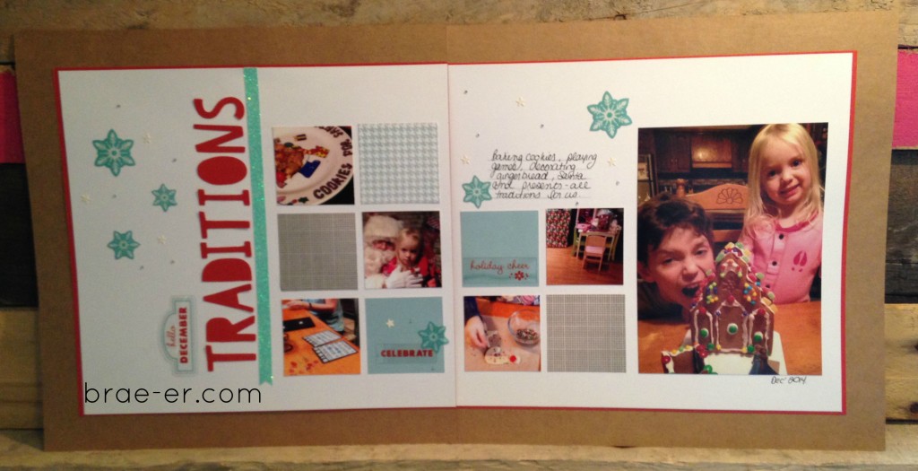
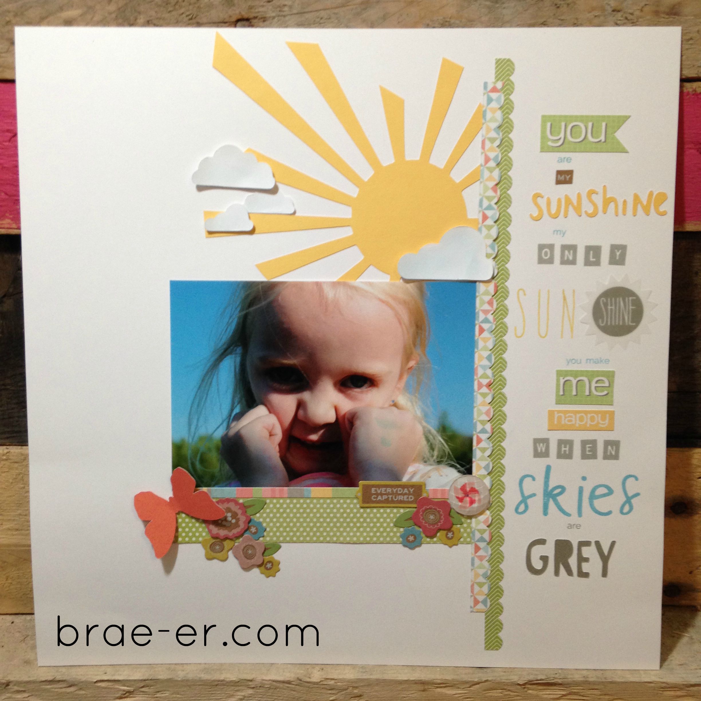
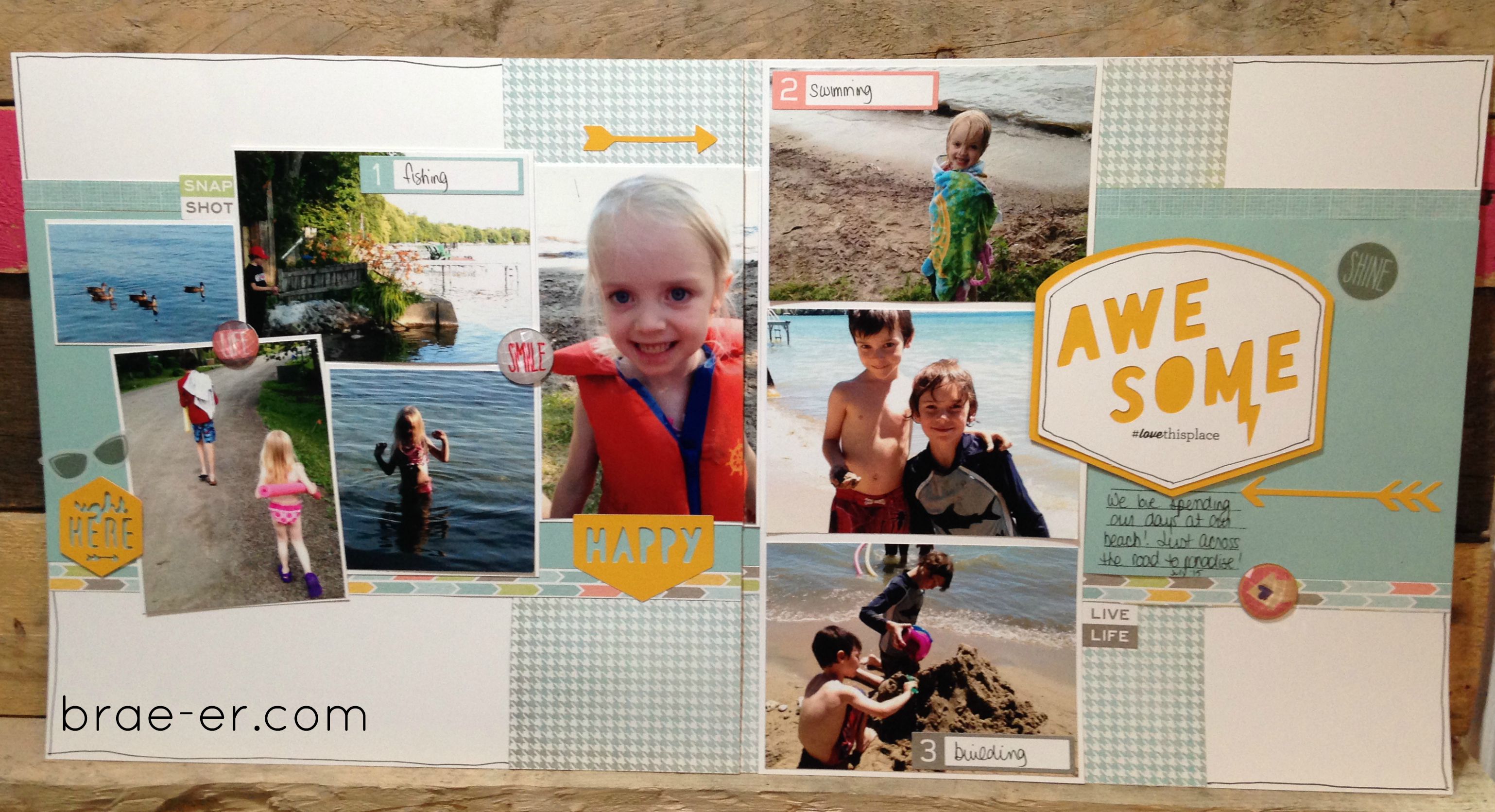
It is likely no secret that I LOVE surfing pinterest for inspiration for my layouts (sometimes I even go old school and look through magazines for ideas and layout inspiration). I love seeing the great things other crafter’s come up with- layout ideas, colour combinations, ideas for layout topics or use of accessories- there is so much to see and learn!
I did this layout after one such session- it was inspired by a digital layout. I loved that it really used no paper other than white cardstock (how often does THAT happen). I also really liked the even, crisp lines. Now I did mine with paper so some of these things were a bit of a challenge but I think I rocked it!
This layout also solved the issue of one of our trips having LOTS of photos- the zoo is a common trip but not one that needs to take up multiple layouts. I like that I could add them all in and even some of the animal photos (which I would usually skip) in the more awkward photo spots.
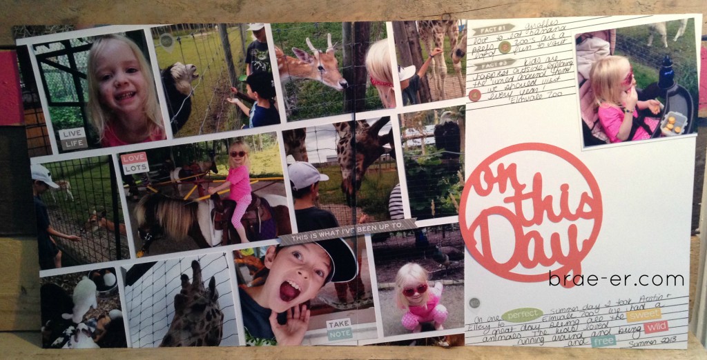
In my journaling I was also able to use up some of the smaller word stickers that come in the Zoe complements- they fit in for words and add some nice highlights to the story of our day.
Have you created any layouts using just white carstock? Share them in the comments!
Until we craft again, The Brae-er

