Tag Archives: double page layout

Mixing it up: Sweet Girl and Into the Wild

Have you taken a good look at these two fantastic paper suites? Sweet Girl and Into the Wild seem to be the perfect collections- one for girls and one for boys. This is, in fact, only at first glance. As you look closer at these collections you will see that they can be used for LOTS of different things and also perfectly complement each other- the colours, accents and accessories all coordinate. When combined- this can give you endless possibilities!

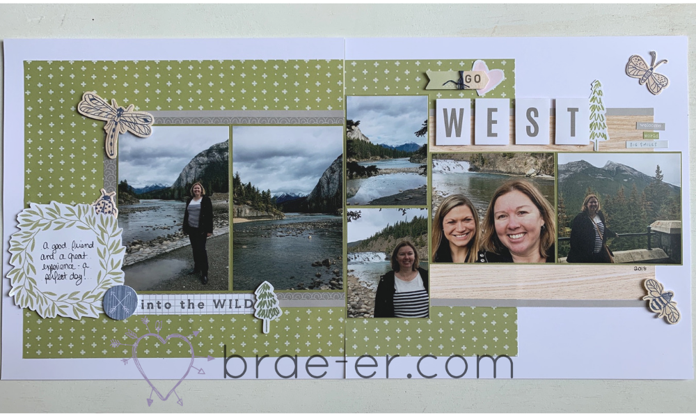
Scrapbook and Cards Today put out a summer sketch call – I love these opportunities to try something new and share all of the great product available to me. It also gives me an excuse to catch up on my own crafting! I started with their two-page sketches (but may go back to try out some of the cards and single page layouts). After going through photos I settled on finishing my quick trip to Alberta last year. The colours in these photos coordinated really well with the Sweet Girl and Into the Wild collections.

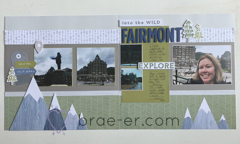
This first layout uses papers from the Into the Wild collection- lots of outdoorsy colours that worked really well with the photos I had selected. I used parts of the complements and the cut apart sheet to add some ‘extra’ to my layout. My fav part has to be the mountains- these are a mix of the paper, the cut apart sheet and a complement. Layered together they add the perfect accent!
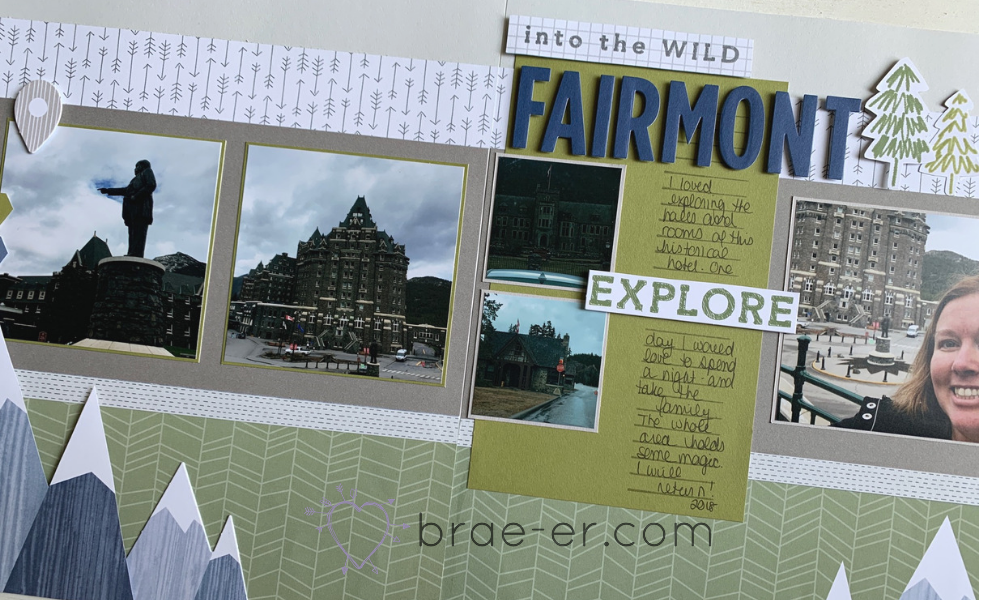
Now here is my second layout. A very similar colour scheme BUT this was done using the Sweet Girl paper. I love the green and wood grain of the papers. The complements used on this layout come from both Into the Wild and Sweet Girl- remember, all the colours coordinate so you can just use what works for your layout!
If you haven’t used these papers yet then I encourage you to get them out and start crafting. I would also love to see what you have created so please, feel free to post your projects in the comments below.

Want to purchase these products? Click on the SHOP button above or here.

Until we craft again, The Brae-er


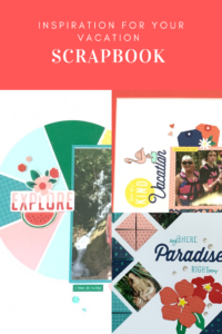
Vacation Scrapbook Inspiration

If you are at all like me, you seek inspiration for your scrapbook pages, especially when you are in a rut OR when you feel an album dragging on. That was my recent feeling about my last vacation album. I had a wonderful vacation and was looking forward to re-living it through my album but I could just… not… get… it… done. In response, I have made my album a vacation scrapbook inspiration post so that I can help others who may be afflicted with this (and if anyone has some inspiration for my other incomplete albums please let me know LOL).

Feel free to pin the above graphic so you can easily find this post again.

Now, let’s get on to the good stuff! The inspiration and fun of a vacation album. Now a quick note: all product used is CTMH. Some product is now retired (it has taken me some time to finish this book) but I may have some tucked away so message me if you are interested in anything.

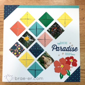
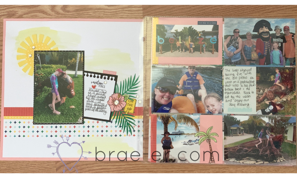
Love this cover page- this one was designed by CTMH art department. As part of earning a trip, we also receive the supplies, directions and pre-cut pieces for part of an album. It is one of the parts I look forward to most when a trip is coming up! This page has little folded squares that add a fun touch to the cover. Nestled among the squares are some of the photos from our trip.

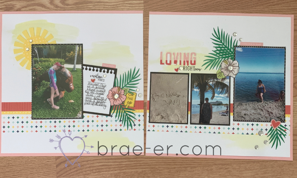
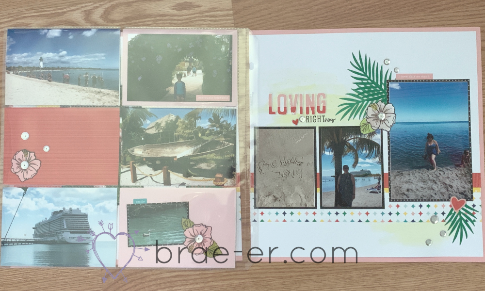
The above three photos are actually ONE layout. I added one of our page protectors intended for pocket scrapbooking as a middle page in order to extend my layout. I made sure to tie it in with colours and embellishments so that it fit the overall look and feel of the layout. This is perfect for when you want too many photos together. You will see a few other options for adding more photos in a post later this week where I will share the remainder of this album.

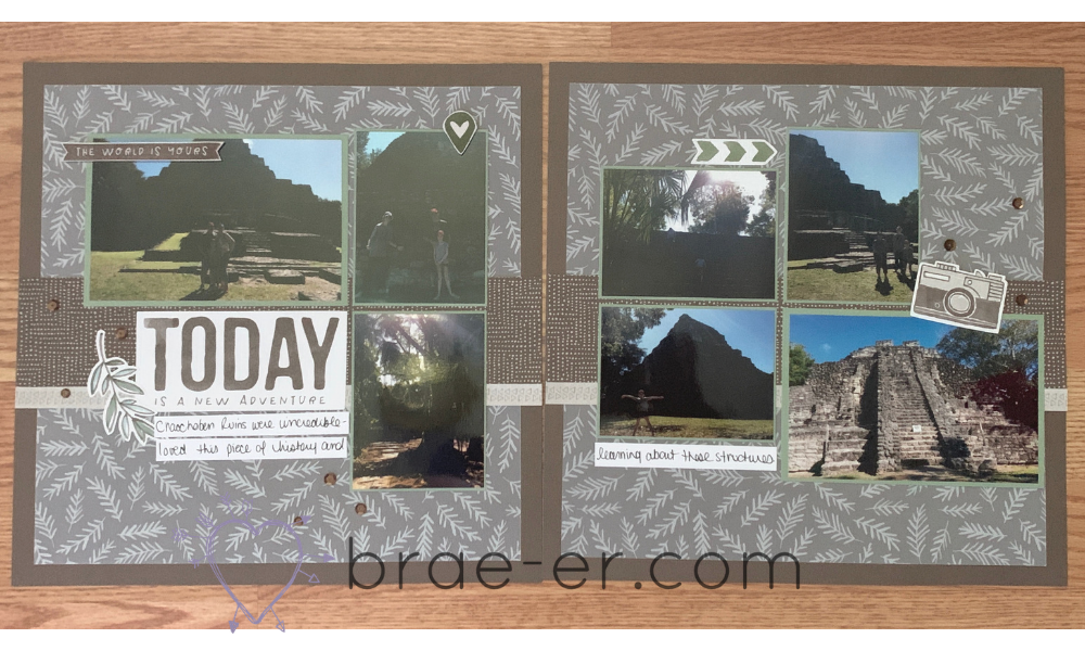
The history teacher in me LOVED this experience as well. My kids also thought it was pretty cool- they spent a lot of time looking up though (we could hear monkey’s in the trees but they were hard to spot).

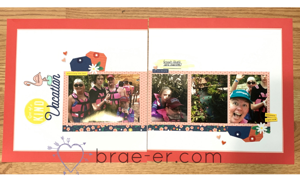
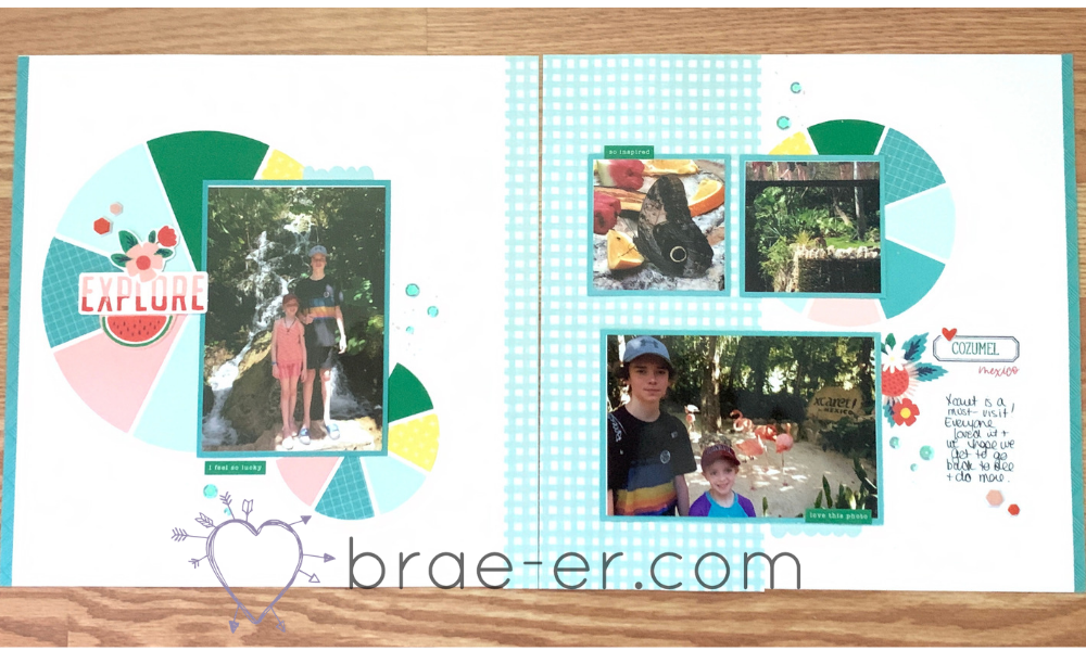
I may have documented this part of our trip twice but it was THAT MUCH FUN! If you are ever in Mexico and can experience Xcaret and the caves then DO IT! We loved it and hope to go back as that park had lots to see and do and we only scratched the surface.

How fun are these circles?! I just love how they look and the punch of colour they add to my layout.

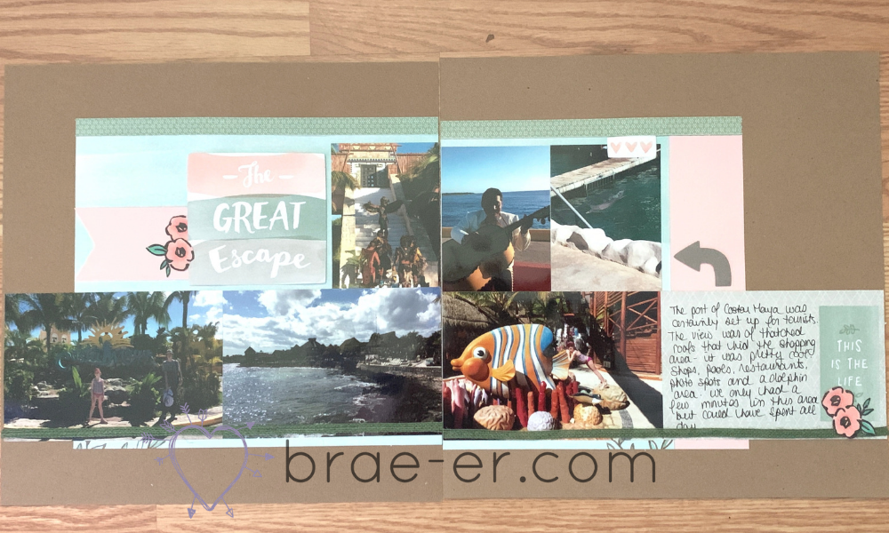
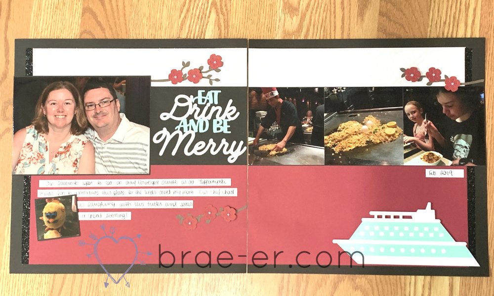
It is important for me to not just document the port fun on my trip- this restaurant experience is one of our faves and this time we were able to share it with our family. I wanted to make sure I documented that as well. Cricut cuts here are all from CTMH cartridges.

I hope you find some inspiration- feel free to scraplift any ideas that may help you out and if you have questions just comment below. I am happy to help!

Until we craft again, The Brae-er