When I grow up I truly wish to be as talented as the people that must work in the Art Studio at CTMH! This board was one of my favourites at convention and I was so happy when I won it in one of our business classes.
This board gave more great ideas and tips for the use of colour and I share them below- read on!
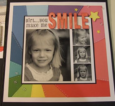
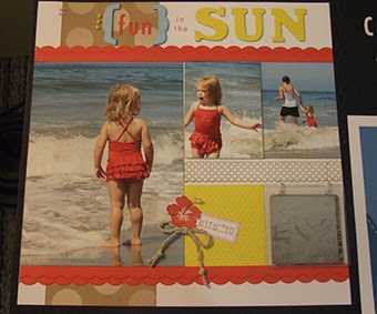
The little mini book is so cute on this layout!!
4 Tips on Colour:
1. Choose colours that enhance your photos.
2. Use the “gallon-quart-pint” rule to determine your main colour and those you want to go with it.
3. Try a split complimentary colour scheme by picking your favourite colour on the colour wheel and then use the colour directly opposite it and it’s neighbor.
4. Jazz up a page with black and white photos by creating a rainbow B&T using all of the colours in the summer palette.
Until we craft again, The Brae-er
Gods mill grinds slow but sure...................................................