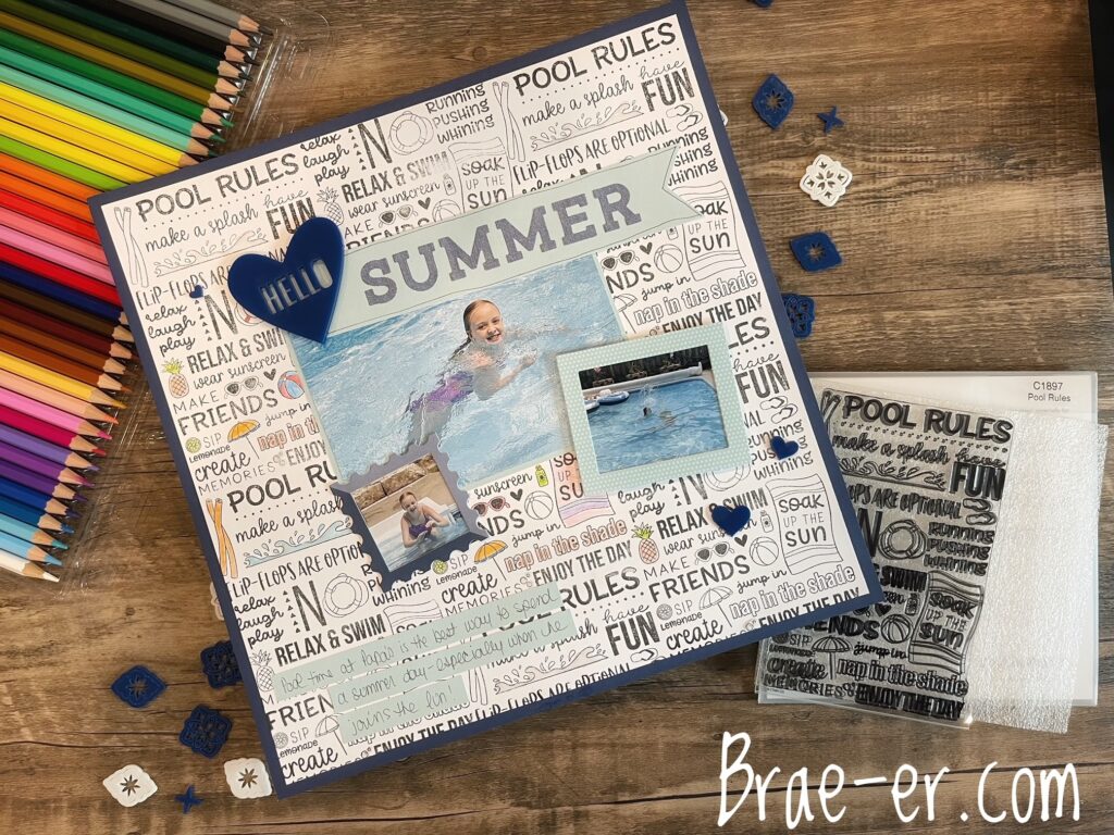
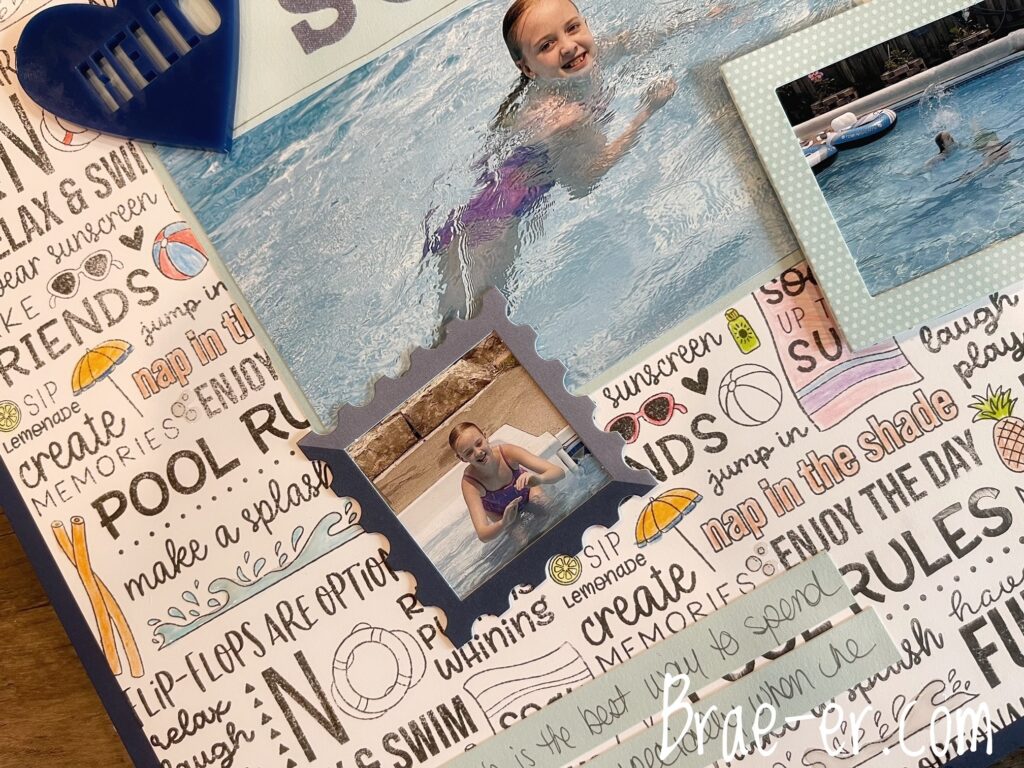
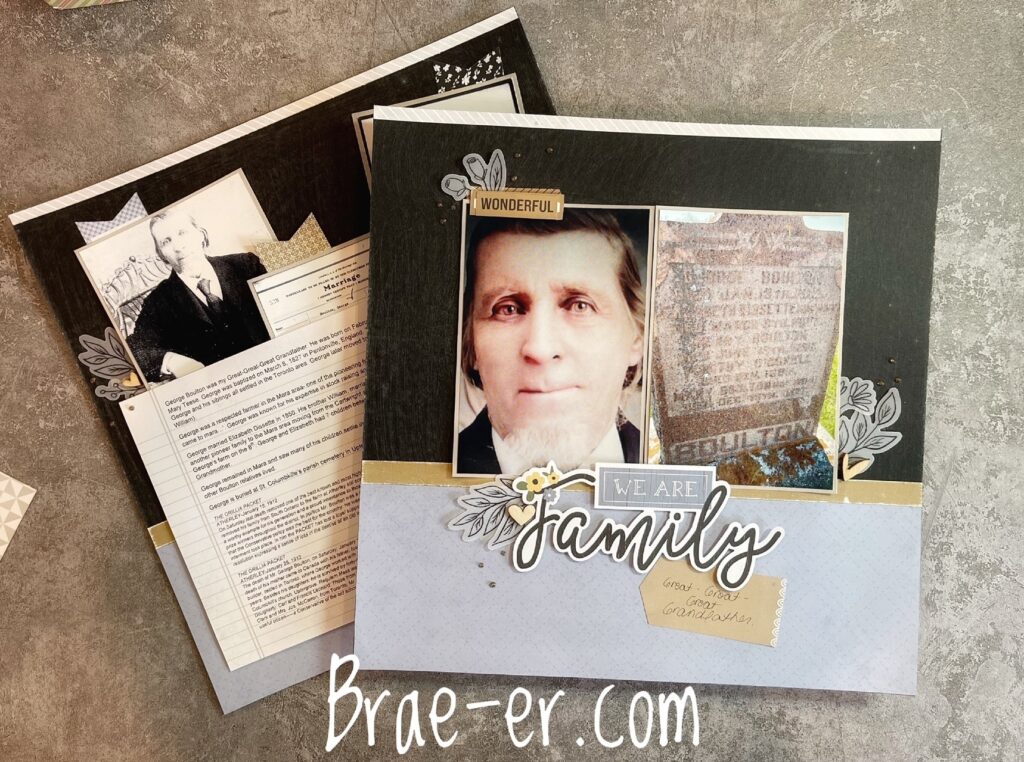
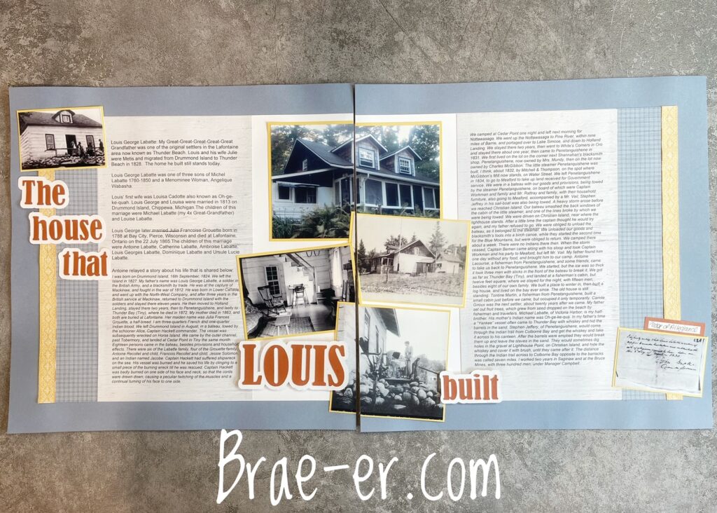
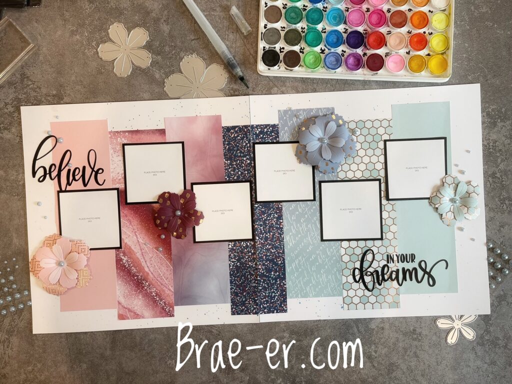
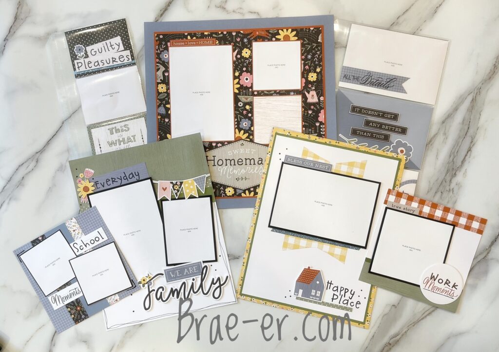
So, maybe you have seen these before but I LOVE, LOVE, LOVE the CTMH layout subscription box. I love getting happy mail three times a year and the kits are always pretty, unique, and oh-so-fun to put together! I also like that I can add my own twist when I need to in order to make the layout work with my photos.
I just completed the ‘July’ layouts and I am again, so impressed. (I put July in quotations because you can put these together at any time once you have them but there is a kit for each month).
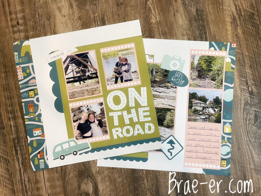
This first layout, ‘On the Road’ I left as it was in the kit. I didn’t need to add much as it worked really well with my photos and it was so pretty (I really wish that CTMH carried that road pattern paper because it is adorable!)
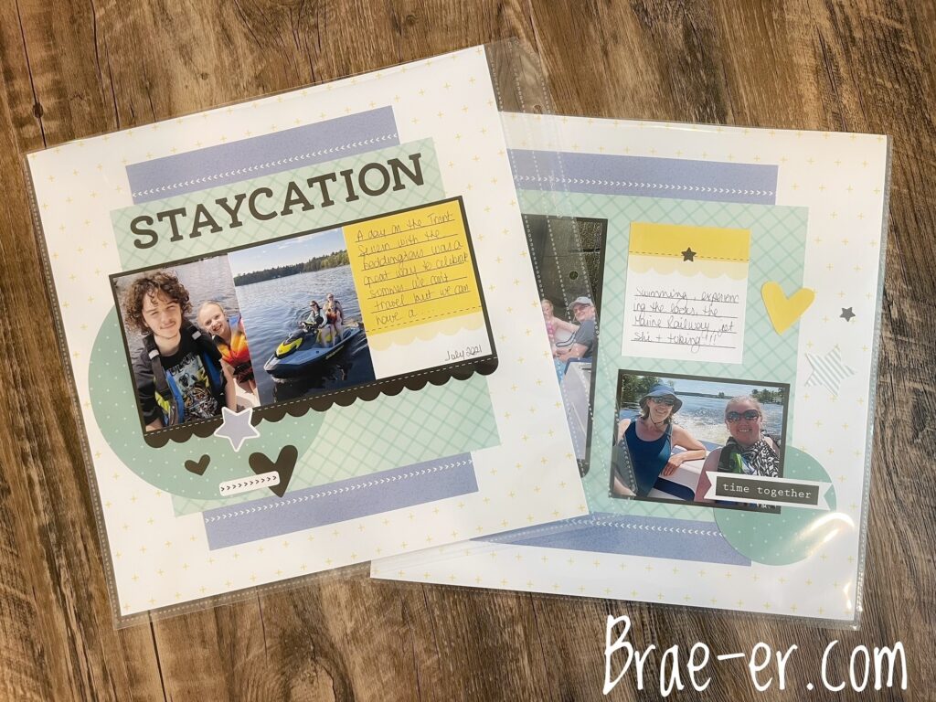
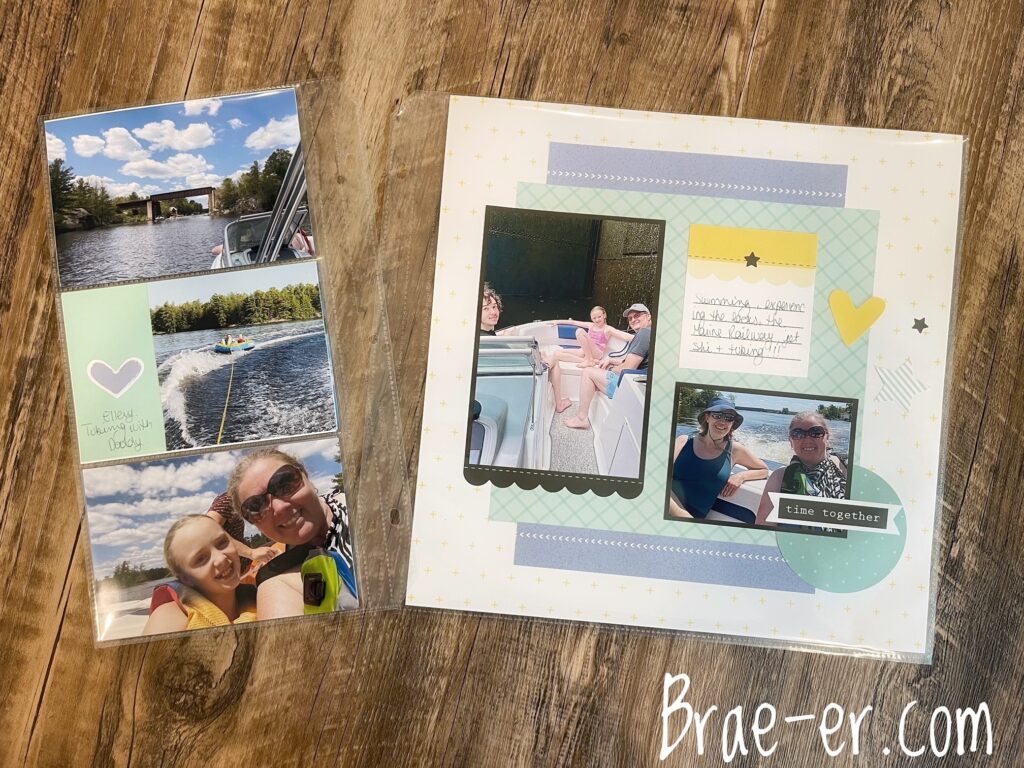
My second layout I did need to change a little because I had SOOOOOO many photos. I also did not want to cram them on the page and throw off the nice balance of photos and colours.
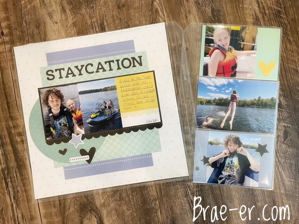
The Memory Protector Plus for 4×6 horizontal photos was the perfect way to add more photos. I added some cardstock in the colours that coordinated with the kit pages (blue belle and mint) and stretched the die-cut accessories a little farther so I could accent a few spots in the protector plus.
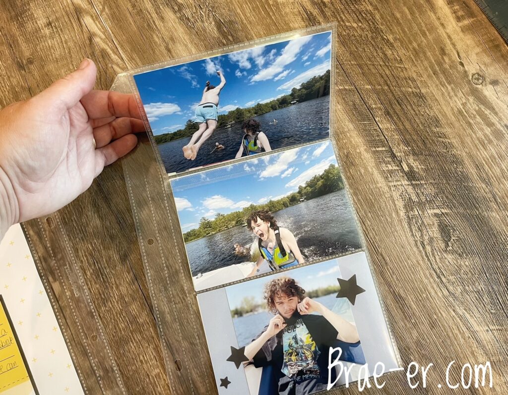
I also added a flip flap on the one part of the protector. It helps to visually tell the story of why my son is looking like a shark bit him! LOL! The water was cold and when someone jumped in … well, it was quite a shock!
If you have not yet checked out our subscription kit then I highly recommend you do- you can see all the details right here.
If you have the subscription I would love to hear about your experience- let me know in the comments below.
Until we craft again, The Brae-er

